2012–2014
2014–2019
2019–present
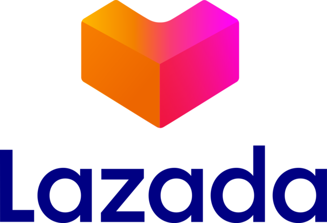
On June 20, 2019, Lazada officially refreshed its identity after 5 years. It brought the three-dimensional boxes that form letter ‘L’ and resembles heart shape, nicknamed Heartgram, next to a new sans-serif Lazada text. The change was actually implemented on app update four days earlier on June 16.
The heart shape, in a slightly different form accompanied with 2014 logo, had been teased from November 2018 on its following promos and advertisements, before being a permanent part of the logo. The recent shift comes along with a new campaign and slogan “Go Where Your Heart Beats” and was developed by Singaporean branch of Superunion.
![]()
Alternate variant used on website, Notice the heartmark was smaller.
![]()
App icon.
")
Official worldwide partner of Olympics logo.